Available Plots#
ppbcc p2analysis and ppbcc p3analysis render eight chart types, selected
by their first argument, and one table. All of them are shown below, all but one
for the same benchmark problem, so they can be compared directly.
Where this data comes from
Every figure on this page was produced from the measurement data in the
results/ folder of the companion repository
performance-portability-benchmark.
Runtimes — the per-platform
Results_*.csvfiles (Results_AMD_MI210.csv,Results_Intel_Max_1550.csv,Results_NVIDIA_GH200.csv,Results_NVIDIA_RTX3080.csv,Results_NVIDIA_RTX4060.csv,Results_NVIDIA_RTX5080.csv), each consolidated from Google Benchmark JSON reports by ppbcc benchmark.Complexity —
results/code-complexity/code-complexity.csv, produced byscripts/generate_code_complexity.pyon top of ppbcc code-complexity (see Applied example: analysing a whole benchmark suite).
The shown problem is matrix multiplication across six GPU platforms,
averaged over benchmark sizes, with the cuBLAS reference excluded so the
vendor library does not define the efficiency baseline on its own.
The complexity comparison shows vector addition instead, whose small
implementations make the difference between the two metrics easy to read.
The source PDFs live in the examples/ folder of this repository.
Chart overview#
Chart |
Shows |
Command |
|---|---|---|
|
Efficiency decay across ranked platforms + PP |
|
|
PP against code complexity |
|
|
Cascade + Navchart + size scaling in one figure |
|
|
Two complexity metrics against each other |
|
|
Efficiency per paradigm and platform |
|
|
Efficiency at two sizes, one split cell each |
|
|
Efficiency distribution per paradigm |
|
|
Runtime per paradigm, grouped by platform |
|
|
CSV: do two problems rank the paradigms alike? |
|
Cascade plot#
The Cascade plot is the canonical performance-portability figure. The left panel sorts platforms per implementation from highest to lowest application efficiency, so a flat line means an implementation performs consistently while a steep drop exposes a platform it struggles on. The right panel shows the resulting performance portability \(\Phi\), and the tile matrix below identifies which device sits at which rank for each paradigm.
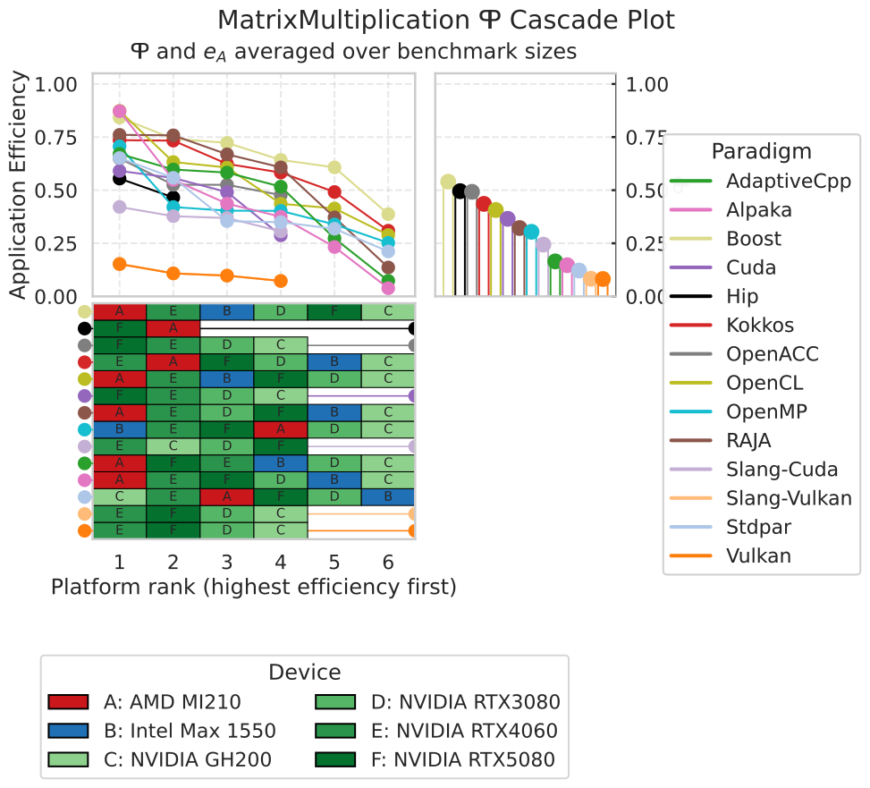
cascade — efficiency decay, \(\Phi\), and the platform ranking.#
ppbcc p2analysis cascade ./Results_* -n MatrixMultiplication \
  --non-zero-pp --remove-description -s avg -x "Cublas"
Navchart#
The Navchart places each implementation at its code complexity (x-axis) and its
performance portability (y-axis). The upper-left corner is the goal: portable
and cheap to write. Pick the complexity axis with -c/--complexity-metric.
Complexity is expressed as a percentage of the plain-C++ implementation unless
--complexity-metric-absolute is given.
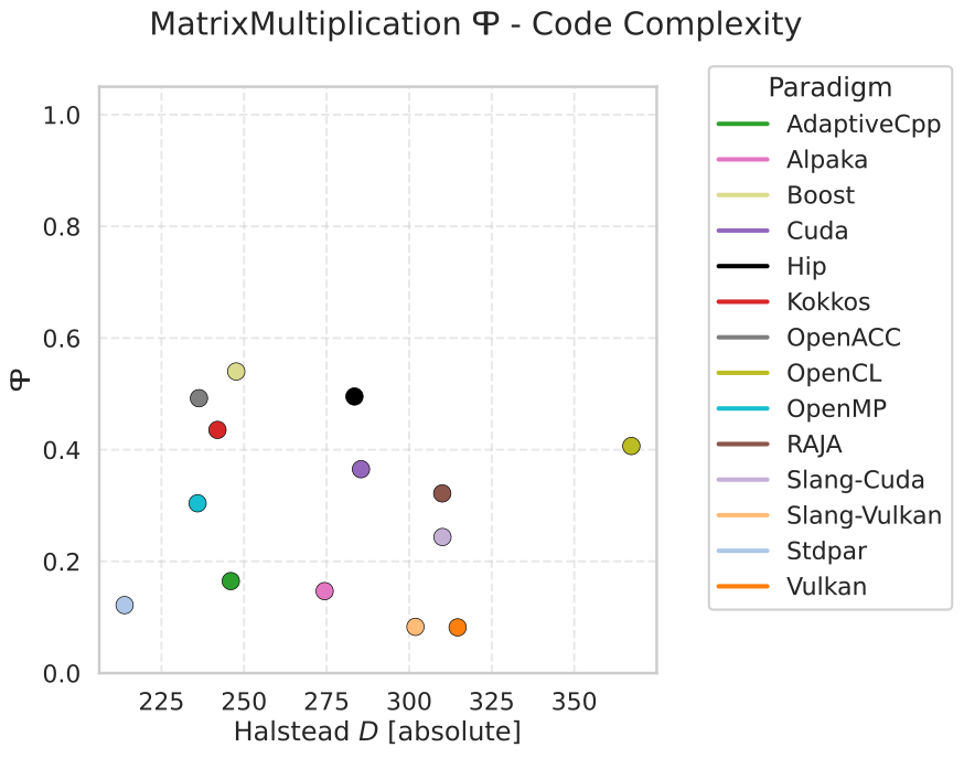
navchart — \(\Phi\) against absolute Halstead difficulty.#
ppbcc p3analysis navchart ./code-complexity/code-complexity.csv ./Results_* \
  -n MatrixMultiplication -c halstead-difficulty --complexity-metric-absolute \
  --non-zero-pp --remove-description -s avg -x "Cublas"
Combined chart#
The combined chart is the summary figure: Cascade panels, the Navchart, and a problem-size scaling panel in one layout, sharing a single legend. It is the one to put in a paper when you have room for exactly one figure.
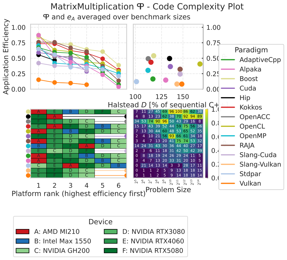
combined — Cascade, Navchart (normalized complexity), and performance
portability over problem size.#
ppbcc p3analysis combined ./code-complexity/code-complexity.csv ./Results_* \
  -n MatrixMultiplication -c halstead-difficulty --log-complexity \
  --non-zero-pp --remove-description -s avg -x "Cublas"
The Navchart panel sits on a percentage of plain C++ axis. Every value is
positive, which is what makes --log-complexity usable — and the log axis
matters whenever one implementation dwarfs the rest, as the two CUDA polyhedral
implementations do at roughly 500 % of the baseline.
The scaling panel is a heatmap over the benchmark sizes, one row per implementation and one column per size, because a line per implementation becomes unreadable beyond a handful of paradigms. Its rows keep the descending-\(\Phi\) order of the platform-ranking panel beside it, so the two lower panels line up row for row.
Column labels become exponents whenever every size is an exact power of one base — \(2^5 \ldots 2^{14}\), \(10^1 \ldots 10^8\) — which is short enough to sit horizontally within one column at a size slightly above the cell values. A sweep that is not a clean power sequence keeps upright decimal labels at a smaller size, since labels that long would grow the figure’s bounding box.
Complexity comparison#
complexity-comparison answers whether two complexity metrics rank the
paradigms differently. Each paradigm is one marker, both axes are relative to
the plain-C++ baseline, and the identity line splits the plane: above it the
y-axis metric charges a paradigm more than the x-axis one — dense lines — and
below it the x-axis metric charges more — verbose code, which is how the two
half-planes are captioned.
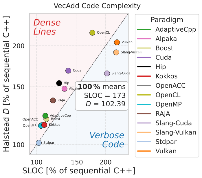
complexity-comparison — Halstead difficulty against SLOC for vector
addition, both relative to plain C++.#
ppbcc p3analysis complexity-comparison ./code-complexity/code-complexity.csv \
  ./Results_* -n VecAdd -c halstead-difficulty --compare-metric sloc \
  --log-complexity --non-zero-pp -s avg -x "Cublas" --remove-description
--compare-metric names the x-axis metric and -c/--complexity-metric the
y axis; both take the usual metric names and aliases. Because the identity line
only means something on a shared relative scale, the chart rejects
--complexity-metric-absolute. -l suppresses the in-plot legend and the
per-point paradigm labels, for placing the chart next to a shared legend.
A key on the right states the absolute plain-C++ values behind the 100 % of both axes, so the chart can be read without the running text. It hangs from half height into the lower-right corner, which the markers leave free because a paradigm below the identity line on one axis is rarely far below it on the other. A chart spanning several problems has several baselines and therefore no key.
Spearman’s \(\rho\) and Kendall’s \(\tau\) are not drawn; they belong in the running text, where they can be given to three decimals and discussed.
Efficiency heatmap#
The heatmap trades the ranking abstraction for raw numbers: one cell per
paradigm and platform, annotated with the application efficiency. Platforms an
implementation was never benchmarked on are drawn as black cells with a dash
rather than as an efficiency of zero — they are what drives \(\Phi\) to zero
without --non-zero-pp. The color scale is fixed to \([0, 1]\), so
heatmaps of different problems remain comparable.
Paradigms are ordered by descending mean efficiency; --sort-alphabetically
orders them by name instead, which applies to double-heatmap as well.
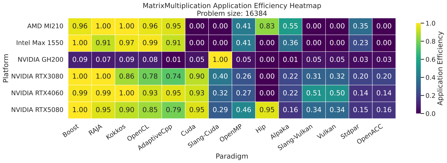
heatmap -s 16384 — application efficiency at one problem size.#
ppbcc p2analysis heatmap ./Results_* -n MatrixMultiplication \
  --non-zero-pp --remove-description -s 16384 -x "Cublas"
Double efficiency heatmap#
double-heatmap compares two problem sizes in one figure. Every cell is split
along its diagonal: the upper-left triangle shows the size given with -s,
the lower-right triangle the size given with --second-size. Both sizes must
be exact numeric sizes, and both halves share the fixed \([0, 1]\) color
scale. A half whose paradigm was never benchmarked on the platform at that size
is black with a dash.
ppbcc p2analysis double-heatmap ./Results_* -n MatrixMultiplication \
  --remove-description -s 1024 --second-size 16384 -x "Cublas"
Efficiency boxplot#
The boxplot shows the distribution of application efficiency for each paradigm across all platforms and problem sizes, with the individual observations overlaid. A tall box means the paradigm’s efficiency depends strongly on platform or size; a compact box high up means dependable performance. Paradigms are sorted alphabetically.
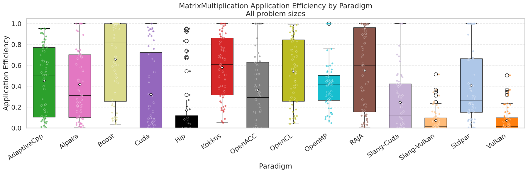
boxplot -s all — efficiency spread across platforms and sizes.#
ppbcc p2analysis boxplot ./Results_* -n MatrixMultiplication \
  --non-zero-pp --remove-description -s all -x "Cublas"
Boxplots accept only -s all or an exact numeric size — the avg,
best, and worst modes collapse the distribution the chart exists to
show. Use -H/--hardware to restrict a boxplot to a single platform; that
option is an error for every other chart type.
Runtime bar plot#
The runtime bar plot shows the measured time itself: one bar per paradigm in
the paradigm’s color, grouped by platform, on a logarithmic axis. Every group
keeps a slot per paradigm in the same order, so a paradigm is found at the same
position on every platform, and a slot stays empty where it has no result. With
-H/--hardware the chart shows a single platform and labels the bars with
their paradigm instead.
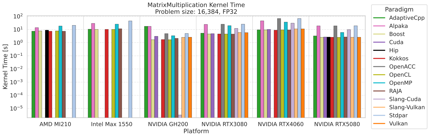
time-barplot -t kernel — kernel time at the largest matrix size.#
ppbcc p2analysis time-barplot ./Results_* -n MatrixMultiplication -t kernel \
  -x "Cublas" --remove-description
-t/--time selects the runtime column — wall-clock (default),
kernel, force-update or neighbor-search — and a column the selected
results do not contain is an error rather than an empty chart. The chart uses
the largest benchmark size unless -s names another one; the avg,
best and worst summaries are rejected, because they would put runtimes
of different sizes into one bar. Runtimes that are missing or not positive are
dropped with a warning, since a logarithmic axis cannot show them. With
--remove-description the fastest variant stands for its paradigm.
--normalize-time-to-peak multiplies every runtime by the published peak
performance of its platform and precision, so the axis shows the FLOPs the
platform could have executed in that time. That puts GPUs of very different
capability on one scale: a kernel that is merely fast because it ran on a big
GPU no longer looks better than it is. The peaks are datasheet values taken
from ppbcc.hardware, which cites the source of each one; they are not the
measured ceilings of Kernel Profiling & Roofline.
-e/--export-to-csv writes the plotted runtimes next to the chart as
<plot-prefix>.csv.
Rank correlation#
Every other chart answers a question about one benchmark problem.
rank-correlation answers one about the set of them: does a problem’s
ordering of the paradigms predict the next problem’s? It writes Spearman’s
\(\rho\) between every pair of problems as a CSV matrix rather than a
figure, because the interesting content is a handful of numbers that belong in
a table or in running text.
ppbcc p3analysis rank-correlation ./code-complexity/code-complexity.csv \
  ./Results_* --correlation pp --non-zero-pp -s avg -x "Cublas" -e
Problem,MatrixMultiplication,NBody,Polyhedral,VecAdd
MatrixMultiplication,1.0,0.754,0.776,0.503
NBody,0.754,1.0,0.785,0.446
Polyhedral,0.776,0.785,1.0,0.385
VecAdd,0.503,0.446,0.385,1.0
A high \(\rho\) means the two problems agree on which paradigms are good; a \(\rho\) near zero means one problem says nothing about the other, which is the case worth knowing about before a single workload is used to argue about paradigms in general.
--correlation picks the variable that is ranked:
pp(default) — performance portability, computed exactly as the other charts compute it, so-s,--average-over,--non-zero-pp,-p/--precisionand the description filters all apply. The default-s alltreats every size as a workload, making \(\Phi\) the harmonic mean over platforms of the size-averaged application efficiencies.a complexity metric —
sloc,halstead-difficultyand the other names and aliases-c/--complexity-metricaccepts. Values are read unscaled; dividing a problem’s paradigms by that problem’s plain-C++ baseline cannot change the problem’s order.
Both variables are reduced to one value per paradigm, since a paradigm is
what the problems have in common — implementation variants such as
Cuda[Naive] exist in one problem and not the next. The best variant stands
for its paradigm in \(\Phi\), and variants are reduced to their median for
a complexity metric. Only paradigms with benchmark results are ranked, so the
plain-C++ baseline and any framework measured for complexity alone stay out and
every variable ranks the same paradigms. Each pair is then correlated over the
paradigms both of its problems have a value for; a pair sharing fewer than
three is left empty with a warning.
-n/--name takes a comma-separated list of problems and defaults to every
problem in the CSVs. -e/--export-to-csv writes the underlying per-paradigm
values and their ranks — best first, which is the highest \(\Phi\) or the
lowest complexity — to <plot-prefix>_ranks.csv. Having no figure, the chart
rejects -l/--legend, --remove-description (which it always implies) and
--log-complexity.
Legends and output#
-l/--legend moves the legend out of the figure and saves it as a separate
PDF next to the plot (<name>_legend.pdf) with four columns; add
--legend--vertical for a single column. This keeps the plot area usable
when a problem has many paradigms.
-o/--output sets the output path; without a suffix, .pdf is appended.
The default name is <problem>_<chart>.pdf. rank-correlation writes
.csv instead, named after every problem it correlated.